Studio....a real blog post.

I had to pick out paint for the new studio. I could have had it painted in the boring eggshell or stark white. I’m betting that a lot of folks will make that color choice because it’s a safe bet. Vanilla boxes work for studios…a lot of folks like them. I guess it helps some folks to focus the creative juices on what they are working on at the time.
Now, me…I believe that color makes the world go round. Yes, I do like some of the more subdued hues like sage and a warm ivory in my home’s walls…but I also have an eclectic blue sofa and lounger with leopard carpet in my living room too. (yeah, like that’s typical American family) In my kitchen and family room, the wall colors are the same but with more subdued furniture. I also have a lot of wood in my home too. So it’s a balancing act.
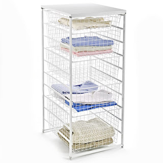
On your right is Elfa Storage that I use for my seed beads and other stuff in the studio.
In the studio, I don’t have wood anything. Most of my design studio furniture and storage is white and from IKEA or Elfa. I like IKEA furniture because it’s modern, functional and affordable. Plus they make all sorts of different color covers. It is also easy to add to, say if I need extra storage or a table…I can drive to either Chicago or Cinni to pick it up. I picked up all the Elfa storage while I was in Austin. It’s is perfect for my seed beads.
The above is a chair that is in my bedroom...see I can be low key. :-)

The above is a chair that is in my bedroom...see I can be low key. :-)
Now you are asking, “Why is COLOR such a big deal?” Or why is any of this a big deal…well, I spend huge amounts of time in my studio and I don’t like hum-ho boring or overwhelming either. Beyond pure aesthetics…color also elicits emotional responses, which as a tangible linkage to my creativity.
I didn’t want green or yellow or orange because it’s a studio. The cast of wall color will change the color though the room. For example, it’s hard to pick out jewelry or beads or color combos of glass when there’s a greenish cast to the room. Normally, white walls are best if you don’t have natural light. Since I do have 4 windows of natural light, I logically had other choices.
I didn’t want green or yellow or orange because it’s a studio. The cast of wall color will change the color though the room. For example, it’s hard to pick out jewelry or beads or color combos of glass when there’s a greenish cast to the room. Normally, white walls are best if you don’t have natural light. Since I do have 4 windows of natural light, I logically had other choices.

